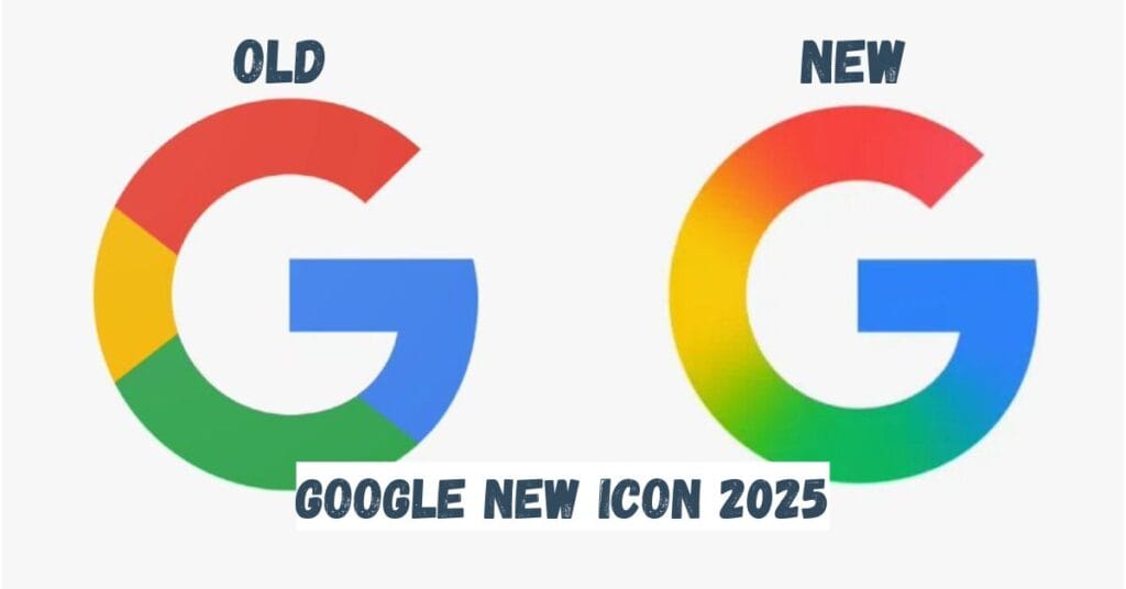
Google New Icon 2025: An important change has been made in the search engine Google. Google has updated its iconic ‘G’ logo once again after almost 10 years. In the year 2015, Google changed its classic logo to the modern typeface ‘Product Sans’. Now, in 2025, the company has added a new visual twist to it.

Table of Contents
How is the Google New Icon 2025?
The ‘G’ icon that was being used till now had four colours – red, yellow, green and blue in different parts.
But now this new logo comes with a smooth gradient transition between the four colours. In this, the colours from red to yellow, yellow to green and green to blue are seen mixing, which makes the icon look more vibrant and modern than before.
Speciality of the Google New Icon 2025: Despite not being too distinctive for the smaller size, the gradient in the new look gives the logo a softer and more fluid effect. The new version is also more friendly to screen technology and is easier to view across multiple platforms.
Which Users Are Seeing the New Google Icon 2025?
This new ‘G’ icon has already gone live in the latest update of the Google Search app on ios. Android users on Android are seeing this icon in the beta version 16.18 of the Google App. The new logo on Pixel devices has also been spotted on Pixel phones.
Changes in Other Google Products?
At present, Google has not made any changes to its main ‘Google’ wordmark. There is no official confirmation about other product icons like Chrome, Maps etc.
Reason for the changes: Google New Icon 2025
The launch of Google Gemini and the growing focus on AI, the new ‘G’ logo is another step in that direction. The Gemini logo also already comes in a blue-to-purple gradient. Google is now making its brand not just technologically but also visually smart and future-ready. Google’s new ‘G’ logo is expected to be rolled out to other devices and platforms in the next few weeks.
After 10 years, Google has updated its logo, showing a fresh look for the company.
— Tech Explorers (@techexplorersz) May 14, 2025
This new design highlights Google’s focus on staying modern and keeping up with the fast-moving tech world.#Google #LogoRefresh #BrandEvolution #TechInnovation #DigitalTransformation pic.twitter.com/7sCenOR48q
User’s reaction: Find and find.
Regarding Google’s new logo, a user wrote, “What! Has Google’s logo changed? I liked the old logo; the old one was better than the new one.” Another wrote – “Google’s new logo is a natural change. It seems as if it has finally found the logo it wanted to be. Very good decision.” Another user wrote, “Google’s new update is really like this puzzle – ‘Find and find'”.

Jay Chavda He is the Founder and Writer of businesspulsecare.com. He is an I.T Engineer, Freelancer, Businessman. He posts Business, Stock/Share Market, Finance Related News and updates on the website. 🔗
